
Rentrax — Product Design Case Study
Rentrax Order Form Redesign
Transforming a complex and outdated rental booking experience into a simpler, modern, and mobile-first multi-step workflow.
 RoleProduct Designer
 IndustryBicycle & Ski Rental
 Timeline2 Months
 PlatformResponsive Web
UNDERSTANDING THE PRODUCT
Project Overview
A redesign focused on simplifying reservations for new and returning customers.
Rentrax is a bicycle and ski rental platform where customers reserve equipment online. Over time, the booking experience became outdated, difficult to navigate, and inefficient on mobile devices.
The redesign focused on improving usability, reducing friction, and creating a faster booking experience across all devices.
Customer feedback also played a major role throughout the process and helped validate design decisions early.
IDENTIFYING USER FRICTION
The Problem
The original order form created friction throughout nearly every part of the reservation flow.
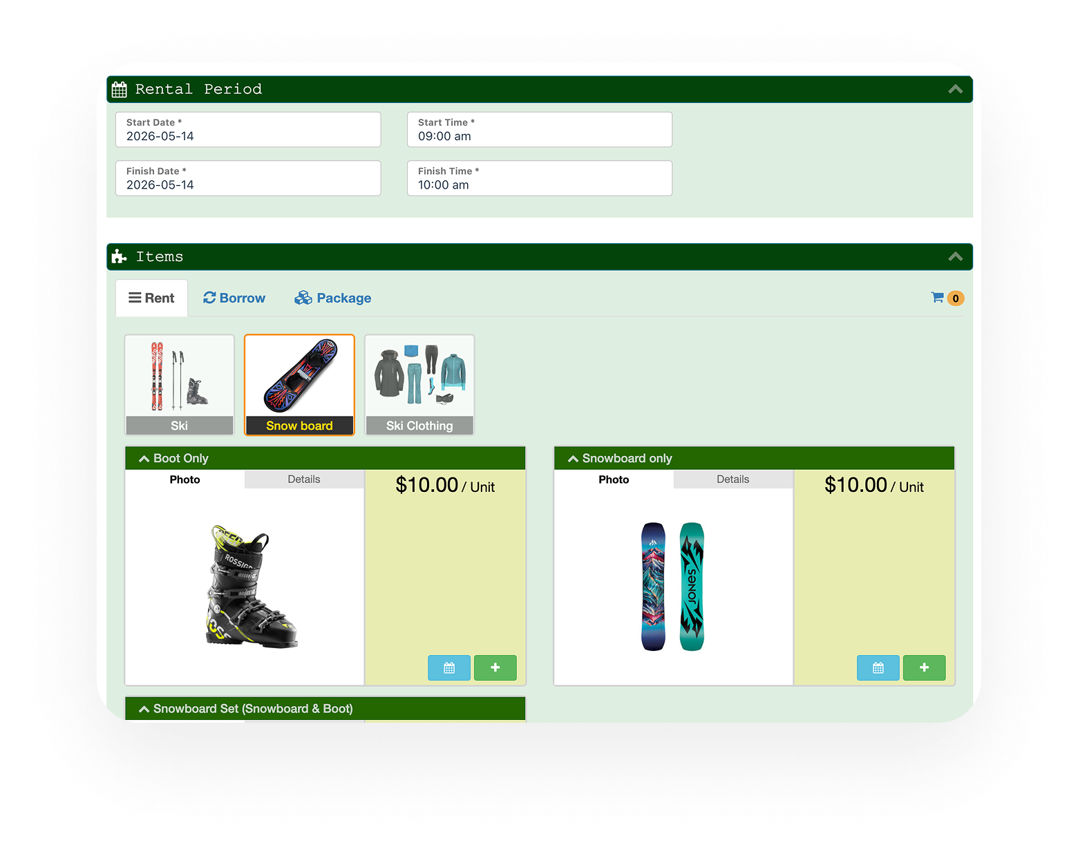
The previous booking experience relied on a long single-page form where all information and actions were displayed at once. Users often felt overwhelmed, especially on mobile devices where scanning large amounts of information became frustrating.
One of the biggest pain points discovered through customer feedback was the lack of reorder functionality. Returning customers frequently wanted to place the exact same reservation again, but the old system forced them to rebuild the entire order manually every time

DEFINING SUCCESS METRICS
Goals
The redesign focused on creating a cleaner, faster, and more efficient booking experience while reducing friction during checkout. The main objective was to simplify complex workflows without removing flexibility from the reservation process.
Special attention was given to returning customers and mobile users, since both represented a large portion of the platform’s usage.

FROM RESEARCH TO SOLUTION
Design Process
The redesign evolved through audits, wireframing, customer feedback, and continuous iteration.
The process began with a full audit of the existing booking experience to identify usability issues, interaction bottlenecks, and layout problems. Existing customer feedback was reviewed alongside the interface audit to better understand where users experienced the most friction.
Instead of redesigning the interface based only on assumptions, the project evolved alongside conversations with real users. Customer feedback sessions continued throughout the design process and helped validate decisions early.
Information Architecture
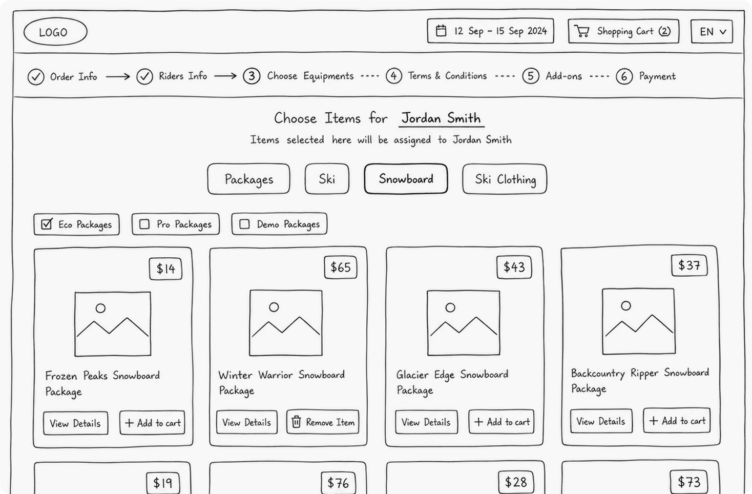
The booking flow was restructured into a clearer multi-step experience to reduce overwhelm and guide users progressively through the reservation process. Instead of presenting all information at once, the experience was divided into smaller focused sections that were easier to scan and complete.
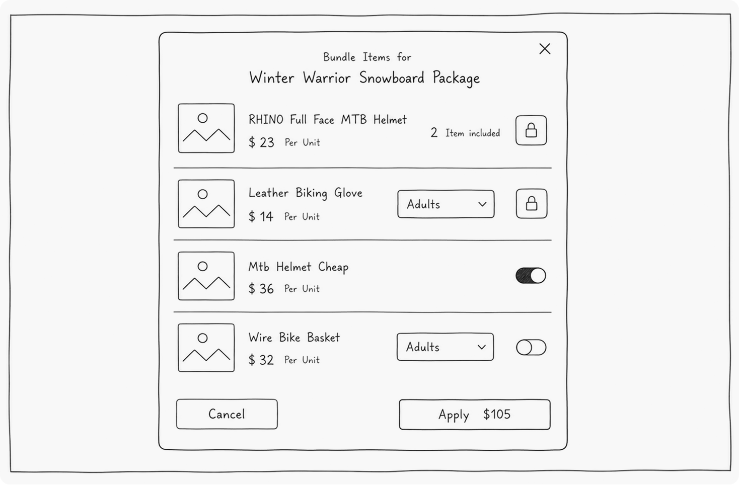
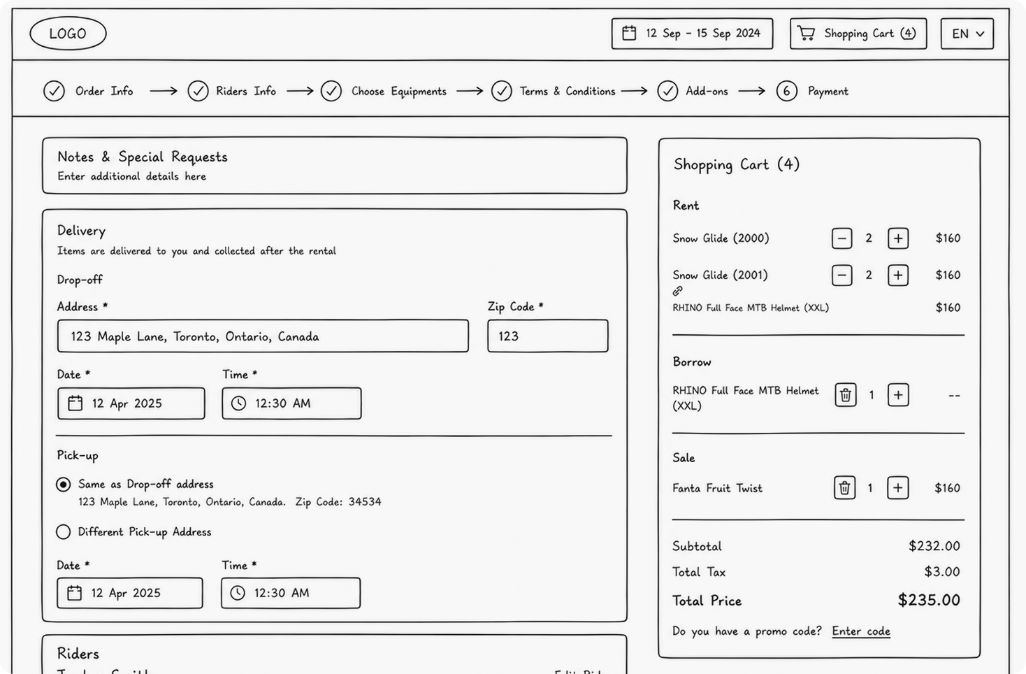
Wire-framing
Low-fidelity wireframes were created to explore different layouts, booking patterns, mobile behaviors, and interaction structures before moving into high-fidelity designs. These wireframes helped test multiple approaches for simplifying the checkout flow while maintaining flexibility for different booking scenarios.
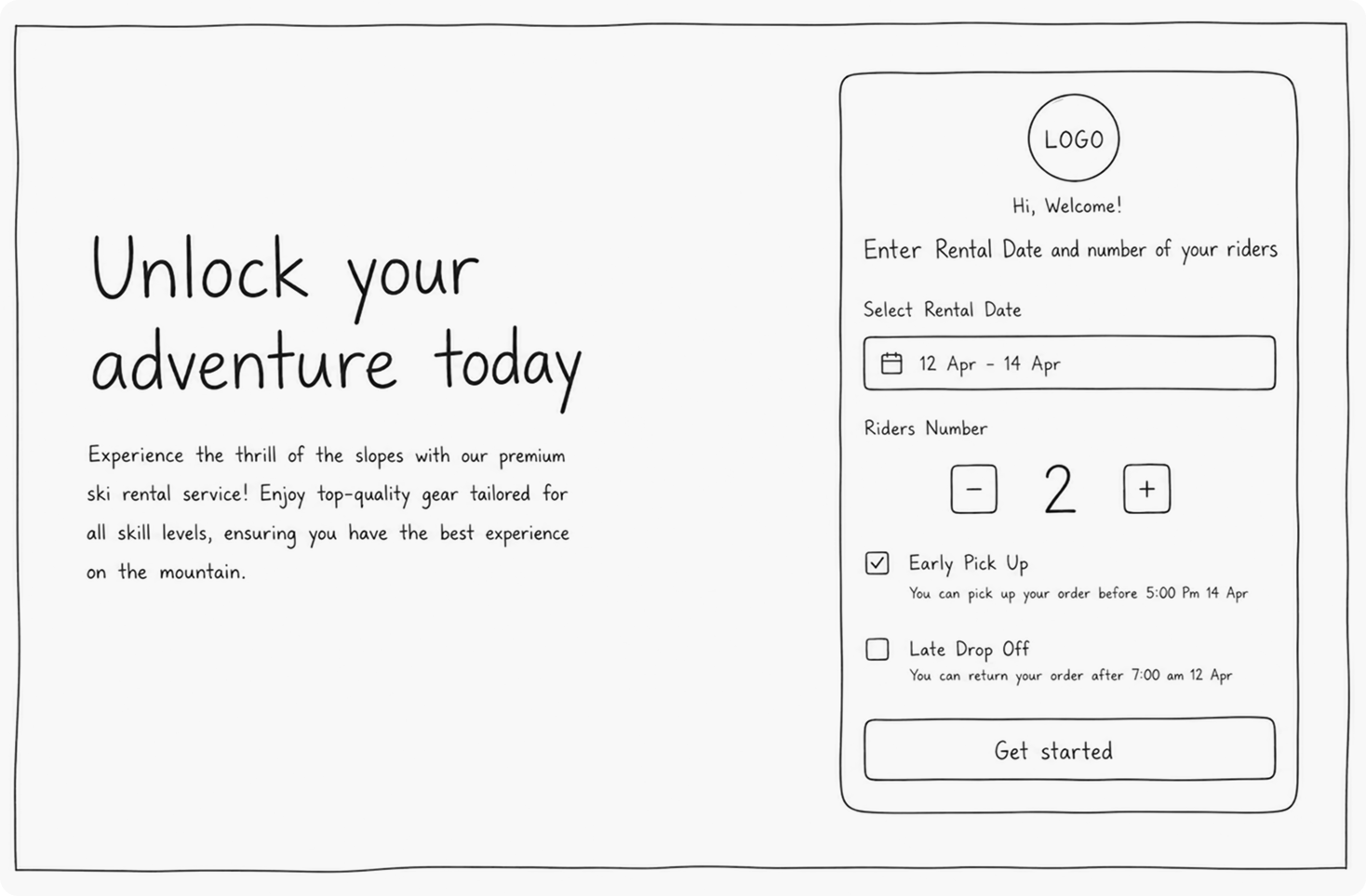
Selecting the Rental Date, Number of Riders and Additional Options on the first page
Visual Exploration
Different visual directions were explored to establish a cleaner and more modern interface. Typography, spacing, hierarchy, and component behavior were refined to improve readability and consistency.

SIMPLIFYING REPEAT BOOKINGS
Reorder Experience
One of the most impactful improvements focused on returning customers.
Feedback from existing customers revealed that many users repeatedly placed similar reservations throughout the season. However, the previous system forced them to manually recreate every booking from scratch.
To solve this problem, a new reorder flow was introduced directly into the booking experience.
After entering their email address or phone number, returning users can instantly view their previous reservations and select one to continue. Instead of rebuilding an order manually, they can move directly to the final checkout step.
Reorder Flow

EASIER AVAILABILITY REVIEW
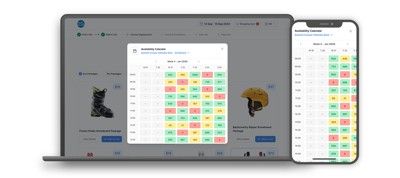
Availability Calendar
Another key improvement focused on reducing uncertainty during the reservation process.
User research showed that many customers abandoned bookings simply because they couldn’t clearly understand when an item was actually available. The previous experience required users to select dates first and only then discover possible conflicts or unavailable time slots.
To improve this experience, an availability calendar was introduced directly into the rental flow.
Before starting a reservation, users can instantly view the exact days and time slots when an item is available. Instead of guessing or repeatedly adjusting their booking dates, they can quickly choose an open time and proceed with confidence.
OPTIMIZED ACROSS DEVICES
Responsive Experience
The redesign followed a mobile-first approach from the beginning of the project.
Since most users accessed the platform through mobile devices, layouts, spacing, typography, and interactions were optimized specifically for smaller screens.
The new multi-step structure reduced perceived complexity by presenting information progressively instead of overwhelming users with large amounts of content at once.
BUILDING A MODERN INTERFACE
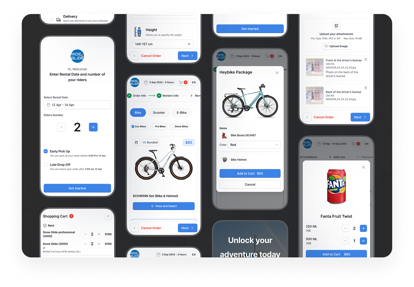
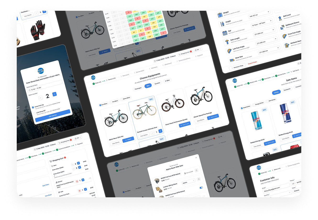
Final UI
The final experience focused on simplicity, clarity, and workflow efficiency.
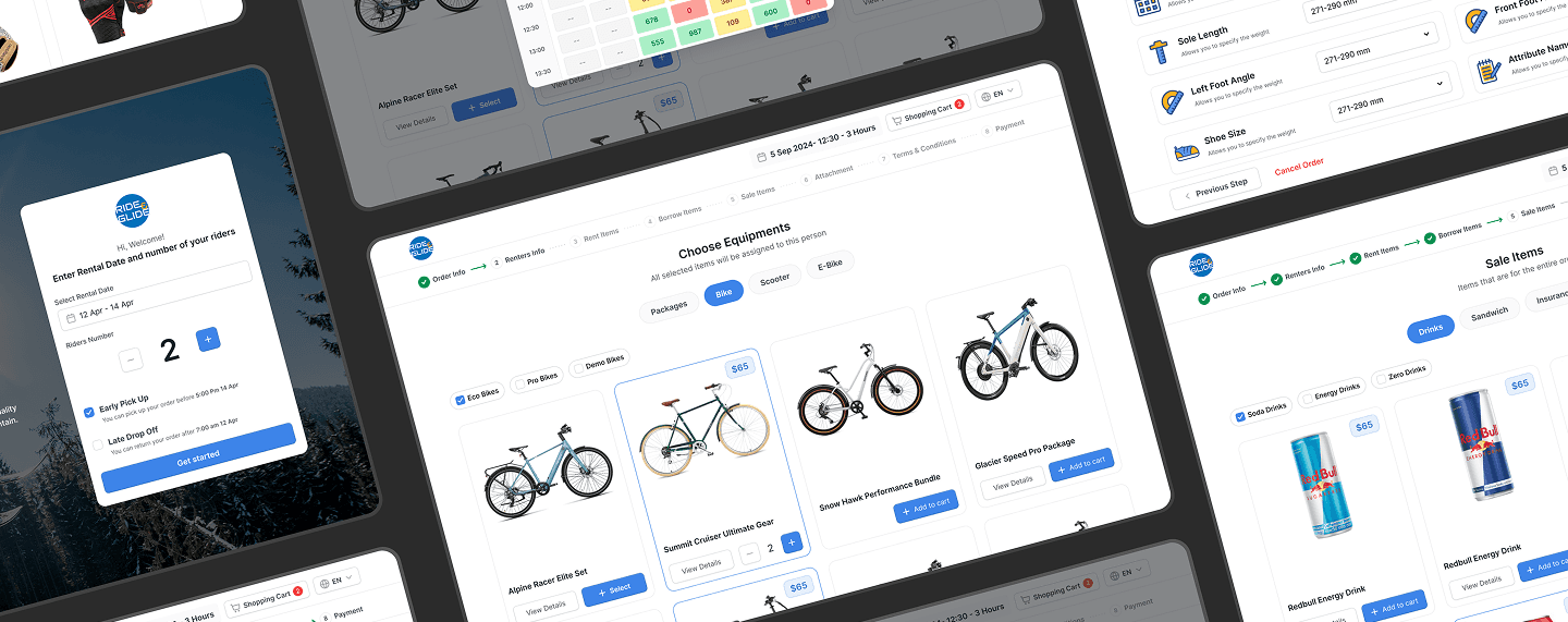
The redesigned interface introduced cleaner spacing, stronger hierarchy, improved typography, and more intuitive interactions across the entire reservation process.
IMPACT & KEY IMPROVEMENTS
Outcome
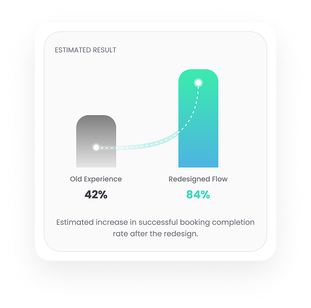
The redesign transformed a complex booking flow into a faster and more user-friendly experience.
Internal feedback and customer responses suggested that the redesigned experience felt substantially easier to use, especially on mobile devices.
The introduction of reorder functionality also addressed one of the most common frustrations mentioned by returning users, making repeat bookings dramatically faster and more convenient.
By combining UX improvements with customer feedback and scalable design principles, the redesign created a clearer, more efficient, and more future-friendly booking experience.
REFLECTION
Designing for real customer behavior
This project reinforced the importance of simplifying complex workflows through better structure, progressive disclosure, and continuous user feedback. Involving existing customers throughout the redesign helped ensure the final experience solved real usability problems instead of purely visual issues.
Built with ♡️ by hamed cheshmberah


